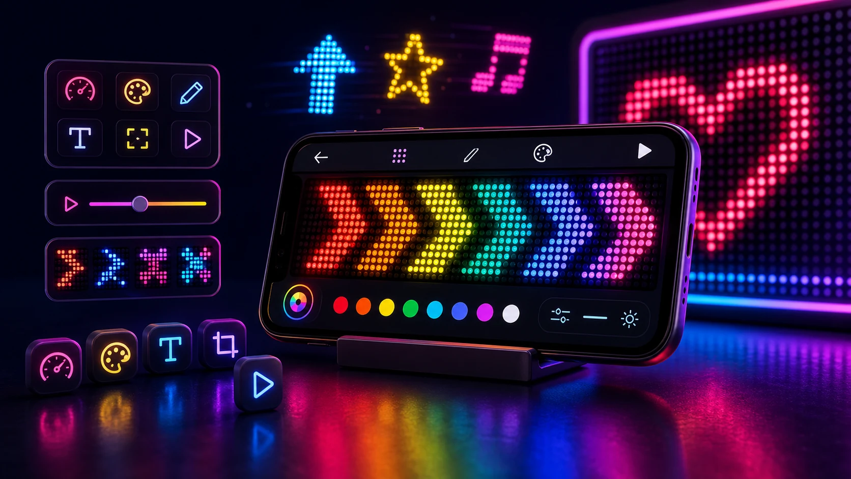
The report was one line: "the text moves too fast and the speed slider does not go low enough."
We could not reproduce it. On our devices the slowest setting was slow. On theirs it was roughly double, and there was no setting that matched what we saw.
They had a 120 Hz phone. We did not.
Per frame versus per second
The straightforward way to scroll something is to move it a bit on each frame. Every time you draw, shift the text a few pixels left, wrap it when it goes off the edge. Simple, and it produces perfectly smooth motion.
It also ties your speed to the display's refresh rate. At 60 Hz, moving four pixels per frame gives 240 pixels per second. On a 120 Hz display, the same code runs 480. The animation is equally smooth and exactly twice as fast, and nothing in the app knows.
It gets worse, because refresh rate is not a constant per device any more. Modern panels change rate dynamically depending on what is on screen, what the app requests, and the device's thermal and power state. A banner could shift speed mid-run when the system decided to drop the panel to a lower rate — which reads as the app stuttering even though every frame is drawn correctly.
The fix is to derive position from elapsed time rather than from a frame count. The frame callback provides a timestamp; the position is speed multiplied by time since the animation started. Skip a frame, get an extra one, run at 90 Hz instead of 60 — the text is in the same place at the same moment either way.
A slider in pixels per second is also a number that means something. Pixels per frame is a number whose meaning depends on hardware you do not control.
Fractional positions and why the text looked slightly wrong
Deriving position from time gives you a fractional pixel offset, and drawing text at a fractional offset means the rasteriser anti-aliases it differently on every frame.
For most animation this is desirable — it is what makes slow motion look smooth rather than stepped. For text, it means the letterforms shimmer slightly as they move, because the sub-pixel coverage of each stroke changes frame to frame. At a normal reading distance nobody notices. On a banner being read from across a room, it costs a little sharpness at exactly the moment you need all of it.
We round the drawing position to whole pixels while keeping the fractional value in the animation state. The text moves in whole-pixel steps, the accumulated error never grows because the underlying position stays exact, and each frame renders the glyphs identically to the last. The motion is fractionally less smooth and the text is meaningfully crisper, which for this app is the right side of the trade.
The screen, and everything trying to interrupt it
A banner has to hold the display, which is a set of small decisions:
The screen must not time out. A banner held up at a station for five minutes is well past any default timeout.
System bars have to go. A status bar with notification icons across the top of a sign is both ugly and a privacy problem — you are holding your notification shade up in front of a room. Immersive mode hides them, and a banner is one of the few cases where hiding them is unambiguously right.
The display cutout should be drawn into rather than avoided. A phone with a camera cutout leaves a band of unused screen if you lay out inside the safe area. On a device being used as a sign, that band is real estate. We draw edge to edge and lay the text out to avoid running it directly under the cutout.
Landscape is the default orientation. A banner is wide. This is obvious and it was not the original behaviour, and the number of people who held their phone sideways while the app insisted on portrait was our fault.
Brightness goes up, for the window only. Same approach as anywhere else: a window-scoped value the system reverts on its own, never the system setting.
The one thing we do not do is take a wake lock. Keeping the screen on through the window flag is sufficient, and it releases itself when the activity goes away — which is the behaviour you want when someone puts the phone in their pocket while the banner is still running.
Making a banner people can read
The engineering gets the pixels right. The message is where banners actually fail.
Fewer words than you think. Scrolling text takes time to read and viewers usually catch part of one pass. "Pickup here" beats "Please come to this side for your pickup." A cheer that fits in three words beats one that scrolls for eight seconds.
Most important word first. People look, read what is there, and look away. If the name or the number is at the end of the scroll, half your audience never sees it.
Match speed to distance and to purpose. Fast reads as energetic and comprehends badly. Use fast for a short repeating cheer where the point is the motion. Use slow for anything containing a name, a number, or an instruction someone has to act on. The further away the reader, the more time they need.
Set the speed for the slowest reasonable reader. You know what it says. They do not, and they are reading a moving target in a room with other things happening.
Contrast for the actual room. Bright text on black works well in a dim venue. In daylight or a bright hall you need the strongest contrast available and a slower scroll. Colour combinations that look good on a phone at arm's length frequently fail at ten metres.
Test at the real distance. Hold the phone at the distance it will be seen from, look away, then glance back. If you cannot read it in one glance, it is too long, too fast, or not contrasty enough. This takes fifteen seconds and it is the only test that matters.
Prepare before you arrive. The station platform, the crowded venue, and the arrivals hall are all bad places to be typing. Write and save the message beforehand; the whole value of a sign is being ready when the person you are meeting looks up.
What it is genuinely good for
A short visible message where sound will not carry or would be rude: meeting someone at a station or airport, a pickup point, a market stall, a table number, a cheer at a concert, a quick sign in a classroom, guiding a delivery driver to the right entrance.
What it is not is a substitute for a real sign that needs to be up for hours. A phone is a bright, battery-powered, hand-held display, and the cases it wins are the ones where you need a sign for ten minutes and did not know in advance what it should say.