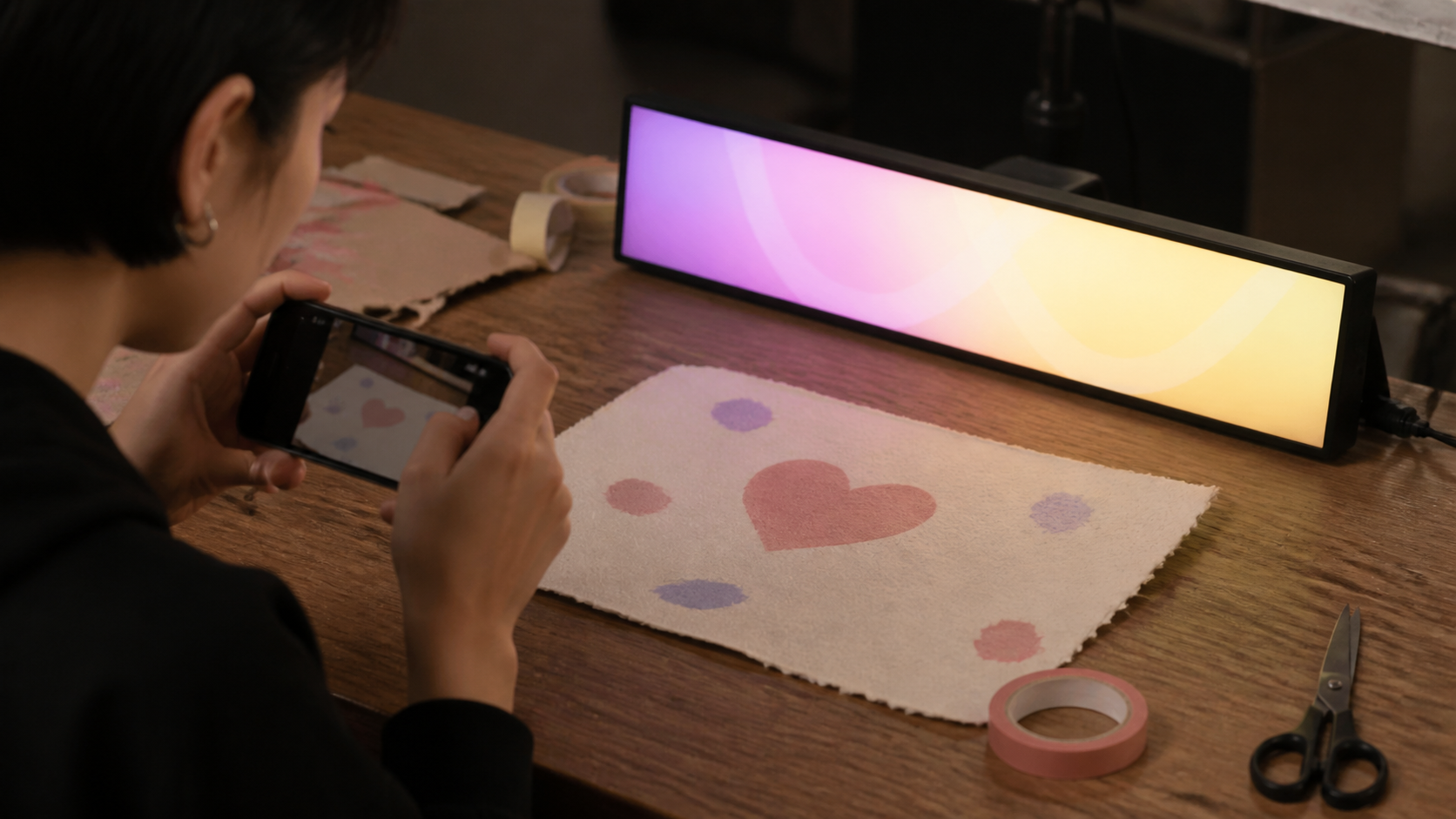
The editor showed a small preview strip while you typed. The banner filled the screen when you ran it. They were built at different times by different means, and it took us a while to accept the consequence: the preview was a different program, and it was frequently wrong.
Two renderers disagree, always
The preview did roughly what the banner did. Same font, same colours, same idea of scrolling. Approximately the same layout arithmetic, reimplemented for a small strip in a form.
Approximately is the problem. Any second implementation of the same visual behaviour will drift, because the two are maintained at different moments for different reasons. Ours had drifted in ways that mattered:
The preview strip is narrow and the banner is a full landscape screen, which changes the ratio of text width to viewport width — and therefore how much of the message is visible at once, and how long the gap between repetitions feels. A message that looked well-spaced in the preview could scroll with an awkward empty pause on the real display.
Speed was expressed relative to viewport width in one and in absolute pixels in the other, so the preview's motion was not the banner's motion.
The preview did not handle the display cutout or the edge-to-edge layout at all, because it had no reason to. So the actual banner had slightly different usable width.
The net effect was that the thing you tuned was not the thing you showed. People adjusted speed and wording against a preview, ran the banner, and found it wrong — and then adjusted it in the full-screen view instead, which meant the preview was worse than useless. It was costing a step.
One renderer, two viewports
The rewrite made the preview a scaled instance of the banner. The same layout, the same measurement, the same time-based animation, rendered into a smaller viewport with the same aspect ratio as the target display.
Because it is the same code, it cannot drift. A change to how the banner spaces its loop changes the preview in the same commit. There is no second implementation to forget about.
Same aspect ratio matters more than same size. A wide banner previewed in a narrow strip tells you nothing useful about pacing, because pacing is a function of how much of the message fits on screen at once. The preview is now letterboxed to the display's proportions rather than fitted to the space available in the form, which uses more of the editor screen and is the entire point of having a preview.
This is the second time in this app that duplicate rendering logic has cost us a bug — the first was text measurement being implemented separately from text drawing. The pattern is consistent enough to be a rule: if two pieces of code need to agree about how something looks, they should be one piece of code.
Sharing a message, and where it goes
The other feature in this release is sharing a message as a web preview: a link that shows the banner running, so someone can see it without installing anything.
This is genuinely useful — checking a phrase with someone before an event, sending a draft to whoever will be holding the phone, agreeing on wording for a stall sign. It is also the first thing in SmartLED that sends anything anywhere, so it is worth being exact about what happens.
The message content is in the link. The text, colours, and speed are encoded into the URL. This means the message is not stored on a server as a record — the page renders whatever the link contains — and it means the link itself carries your message, so anyone with the link has the text.
Korean text makes for long links. Percent-encoded UTF-8 uses several characters per Hangul syllable, and messaging apps and QR codes both have practical limits. A long message can produce a link that some destinations truncate. We warn when a message approaches a length where that becomes likely, rather than producing a broken link silently.
Sharing is explicit. There is no automatic upload, nothing syncs, and a message you never share never leaves the phone. The app's default position — everything is local — is unchanged; sharing is a thing you do.
If a message is private, do not share it as a link. This sounds obvious, and links get forwarded, which is exactly why it is worth saying in an app where the content is often a name.
The editing loop this enables
With a preview that matches, the workflow becomes short.
Write it in plain language first, without thinking about the display.
Cut every word that does not change the meaning. This is where most of the improvement comes from and it is always more words than expected.
Preview at the real proportions. Watch how the first word enters and how much dead space follows the last one. Awkward pacing is usually a message that is slightly too short or slightly too long for the loop, and adding or removing one word fixes it.
Check the entry and exit. People catch the middle of a pass. If the important word only appears at the very end, reorder.
Share it if someone else will hold it. The person holding the sign should have seen the sign.
Then test at the real distance. The preview tells you about pacing and spacing. Only holding the phone at the distance it will be read from tells you about legibility, and no preview replaces that.
What we did not build
There is no template gallery and no library of pre-written messages. Every case we can think of where SmartLED is genuinely useful involves a message specific to the moment — someone's name, a table number, a door. A gallery of generic phrases would make the app look fuller and would not help.
We also do not render the shared preview server-side to an image, which would make it show up as a thumbnail in messaging apps. It is on the list and it would mean the message text passing through a renderer we operate, which is a different privacy statement from a link that renders in the recipient's browser.